Sunday, November 29, 2009
Friday, November 27, 2009
Monday, November 23, 2009
Kasper - John's advice
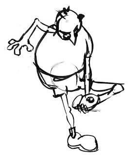
Here's the JohnK thumbnail I'm working on:
It took me several tries before I even started to understand this drawing, but I've come to love it.
There's a lot going on here.
The main point of this drawing is the anticipation as Kaspar prepares to penetrate the man sock with his oversize foot and overgrown toenails. In my first few tries (which I'm not going to post), I kept leaning the bear backwards. After all, the pose doesn't make sense - he's off balance. Well guess what? It lost all its energy when I did that. I finally realized that the composition consists mainly of lines that point directly to the target sock.
Secondly, there's Kaspar's delight in anticipation of the destruction and its effect on the sock owners. He's looking over his shoulder at the humans sleeping in bed. But, unlike an earlier thumbnail where he's pawing through the sock drawer and looking back at the bed, here he is NOT being sneaky. He's relishing his naughtiness. He's thinking, "Just wait till they find this!"
Here's another attempt, which I then marked corrections on.
Posted by
LeoBro
at
12:55 PM
0
comments
![]()
Labels: Kaspar
Wednesday, November 18, 2009
Saturday, November 14, 2009
Kaspar - set 2


After reading John's comments on other people's work, and seeing some of the great work that people like John Atkinson are doing, I think I understand a bit better what JohnK was looking for.


Is that more like it?
Posted by
LeoBro
at
5:34 PM
0
comments
![]()
Labels: Kaspar
Sunday, November 08, 2009
Kaspar - rough layout
From this series of storyboard sketches.
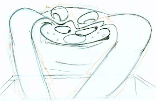
Kaspar is intensely focused.

Mine above lost a bit of the scrunched intensity of the orginal. But I like how I brought his wrists closer together and bent his hands away from each other; it gives more of the feeling of him pawing through the garments.

I don't know what I was thinking with that arm. Also, it's too "cute" and missing the exagerated upward motion of Kaspar's surprise.

On my second try, I like how I pushed that upward surprise stretch even further than the original. But it doesn't look enough like Kaspar.

This one missed the original expression.

Second try a little closer. Still not evil enough...


I've never drawn this character before, and I've never tried cleaning up great roughs like this. So I know there are a million things wrong. Any advice is welcome - I'm happy to be the "don't do it like this guy" guy!
But this was really fun! I'm going to do more.
Posted by
LeoBro
at
9:25 PM
0
comments
![]()
Labels: Kaspar
Saturday, November 07, 2009
 I've been wanting to loosen up in my drawings and have more fun with them. I tend to be sort of a pleaser and perfectionist - which seems to lead to dull drawings.
Posted by
LeoBro
at
10:58 PM
0
comments
![]()
Tuesday, November 03, 2009
Popeye Toy Turnarounds
First try: (too stiff, and pretty far off

Second try. Better:

7/8ths view:

This is fun.
Three-quarter view:

Front view:

Reverse profile:

Back:

I think I improved as I went, but mine don't look near as loose as JohnK's:
Posted by
LeoBro
at
11:50 PM
1 comments
![]()


