Friday, June 23, 2006

Lesson 1 Crows

Still in the midst of ASIFA-Hollywood Animation Archive Project Blog: Meta: The $100,000 Animation Drawing Course- Lesson 1.

Here's a case where I just kept making the same mistake over and over.


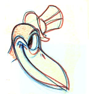
On my first try of the first crow, I got the overall outline fairly accurate, except that I staightened out the tip of the beak. But for some reason, I got completely fooled by the eye. I'm not sure why. Possible I was looking at the line representing the top of the beak, connecting to the bottom of the eye, and misread it as a level line. In my version, I leveled that line considerably, resulting in the eye starting much higher than it should. But I lined up the top of the eye correctly with the rest of the head, so the end ended up being way too small.

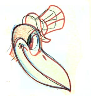
I knew that didn't look right, so -- without checking the scan -- I tried again, paying even more attention to the outline. This time the beak is remarkably accurate, but the hat is way small, and the mistake with the eye position is even worse! (I probably scaled the hat off the eye, so they both ended up too small.)

My second try:


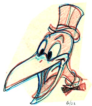
I think I did a scan after the second one, and realized the problem with the eye. So I tried a third time, and dang if I didn't do the same thing again. Actually I had the eye almost in the right position in blue pencil, but changed my mind! And I missed the connecting line at the top of the beak. Other than that, there's a respectable accuracy about this try.


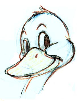
I only did one try of the second crow:


Overall, it's too "pointy" -- in subtle ways I exaggerated the diagonal stretch. And the jaw is extended too far; as it was for my earlier wolves.

Thursday, June 22, 2006

Darn duck

I thought this duck was going to be so easy compared to the other ones I've been doing. It looked so pleasantly round and self-contained. I was wrong.

On my first try, I mistook the basic shape for a circle, when in fact it is (obviously in retrospect) an oval. That made the entire face too wide.

My second try, when viewed here as an overlay over the book drawing, lines up pretty well. But on paper, when I finished drawing it, it looked pretty wrong. The angle of the eyes is not quite right, and the bill doesn't scoop down low enough. Still, it's better than I thought it was:


My third try is also pretty good, but the head is just a little too narrow and the cheek is pinched back a bit too far. It changes the look and personality of the duck just enough to make it look wrong:


My fourth try is the best, but I'm still pinching the cheek back too far. Oddly enough, I thought this one looked right on paper (before scanning and checking), while I thought the previous ones were very wrong. In fact, they are all have about the same degree of accuracy/inaccuracy. I think the difference is that fourth one best captured the look and feeling of the character. Significantly, the fourth one is the most accurate with regard to the eyes. The angle of the eyes is dead on. It's interesting how big an effect this has on the overall likeness, even though there's a big problem with the cheek:

Since I only have about half an hour a day to work on this, it takes me three or four days just to work through one drawing from the book. I can't believe it takes so long. But I'm really into trying to get the subtleties right.

My wife watched me for a while and suggested I might be missing the point. Maybe so, but if I can't copy the drawing so that it looks like the same character, then there's no point going any further. After all, if were trying to animate this duck, I would need to make each drawing appear to be the same duck as it acts out a scene. This level of control is exactly what I've been missing and what I most want to work on. So it seems worth the effort.

Next up: the crows!

Monday, June 19, 2006

Three Wolves

Still working on Lesson 1 (ASIFA-Hollywood Animation Archive Project Blog: Meta: The $100,000 Animation Drawing Course- Lesson 1), moving right along to the three wolves. They look so easy! Here's my second attempt at the first one. It still has some major problems, but this time I really paid attention to the muzzle, and I got it pretty dang close. (In all my posts, I've made the book appear in red; my lines are blue/black).

One thing that really threw me, and took me a while to figure out, is that the construction drawing in the book is tilted several degrees compared to the finished drawing. I started my drawing by copying the construction drawing, then moved to the "finished" drawing and copied that over my construction drawing. But things just didn't line up. That was still confusing me on this one.

Here's another try:

Muzzle problems again!

Here's the second wolf from the book.


This is one of my first drawings that really is consistent end-to-end. Of course I might spend half an hour on each try, which seems terribly long -- but I'm practicing. The only serious problem with this one is the upper lip. Also, as my wife pointed out, my eyes look more evil than goofy -- it's because I made the eyelids more curved and lower down on the eye. Is that my personality showing?

Here's wolf #3 -- the position of the ears and the bottom of the jaw are the obvious issues.

Thursday, June 15, 2006

Blog Dogs

Still on Lesson 1, but moving on to the second page, here's my attempt at the top dog. Again, my lines are blue and black; Preston Blair's lines are red.


Once again, the peripheral elements are increasingly out of whack the farther they are from the center of the head.

Here's the second dog on the same page of the Blair book. My version alone is on the left. I'm very happy with the look of my drawing. It captures the spirit of the original. On the right is my drawing overlaid on Blair's version. It's pretty close, except for the collar where I obviously wasn't paying attention. And the nose is still too long.


The book says to "draw this dog in other positions", so I did. Here's one of two such poses:


I had trouble understanding the three-dimensional shape of the muzzle, especially since the book doesn't really provide construction lines for it. So the above doesn't look quite right and I don't know how to fix it. But I'm proud of how the drawing "reads", and it mostly looks like the same dog, only a bit off model.

These were done from 5/30/06 to 6/2/06.


Tuesday, June 13, 2006

Catching up

A little late to the party, but I finally gave in to the temptation to have my own blog to track my progress in the $100,000 Animation Lessons.

I've had the Preston Blair Animation book since I was in sixth grade. But it wasn't until JohnK started posting his lessons that I realized how much there was to it. Now that I get it, I'm committed to doing it right no matter how long it takes.

I drew all the eggs... here is one I saved. This is from mid-May, 2006:


Preston is red; I'm blue.

As soon as I tried this I realized how very difficult it was to get the proportions and shapes correct just by eyeballing it.

At first I was using my own copy of the book, which has slightly different versions of the characters than the 1949 version, which JohnK is using.


I tend to make the things that stick out at the periphery bigger and longer than they should be, like the elephant's trunk and ears.

I have more but I'll post them later.