Monday, February 19, 2007

Lesson 4, Part 7

Yay for me, I finished Lesson 4!


I felt pretty good about doing this one.

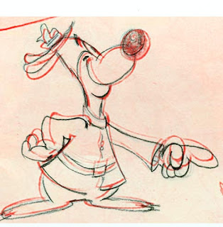
Here's the comparison to Preston Blair's original. There are still some dumb mistakes - especially the size of the nose - but considering I did that entirely visually, it's a great improvement. Also I did it faster than the other ones in this lesson.


Thursday, February 15, 2007

Lesson 4, Part 6

I thought this was pretty good...

Until I compared it in Photoshop...

Tuesday, February 13, 2007

Lesson 4, Part 5

This little guy took over an hour, but I did it without checking until I was done.


Comparison with the original (in red):


Click to see animated GIF comparison:

Thursday, February 08, 2007

Lesson 4, Part 4

Ok, so I'm really dragging this lesson on and on!

I bragged in the last post about how my eye was so much more discerning. Well, the next night I spent nearly an hour on this character swiveling his head around. (I think it's a mouse?)

Once again, as soon as I felt like I was finally done, I got ready for bed, then came back and looked at it. It was terrible! I'd straightened it all out. Yuck!

So the next night I started over with a clean sheet of paper, resolved to really see what I was looking at. I drew lightly in blue for maybe fifteen minutes, and I could already tell I was making exactly the same mistakes. The body didn't seem to be leaning forward far enough, and the head seemed too small. But I could not figure out how to correct it, and I didn't want to spend a whole hour barking up the wrong tree again.

So I cheated.


I scanned the rough and compared it in Photoshop (above). Wow. The differences in the lower body were subtle but important. The curve in the hind leg that I was making too vertically straight made a huge difference in the overall perception of how the body was leaning.

I was also amazed that I had so much of the head exactly right, except the face was pushed in a whole eyeball width! How could I not see that?

So the next night, working from memory of the comparison, I went back to the drawing board and corrected the blue, then pencilled it in black.

Finally I compared it again. Except for the hands and nose tip being too small, it's not too bad.

Considering I cheated.

P.S. I really enjoyed the feeling that I was drawing three-dimensional volume in this character. Especially the organic shapes of the belly and the head.

P.S.S. Bonus comparison. Yikes!


Monday, February 05, 2007

Lesson 4, Part 3

Well, I know I'm making progress because it's easier for me now to see my mistakes on the paper, before I dash off to the scanner and do a Photoshop comparison. The problem is... I see my mistakes on paper. So drawing is taking longer and longer. I keep drawing, noticing it looks wrong, figuring what is wrong, fixing it and checking again. Over and over and over.

Using blue pencil, I worked on a drawing of the duck with the slingshot for nearly an hour. When I thought I was done, I realized it was fundamentally wrong. So the next night I started over on a new sheet of paper, and spent another fifty minutes just on the blue pencil. When I was done, it was close, but still visibly wrong. So the next night I spent another half hour fixing the blue, and then tracing it in black. An hour and half on a single drawing!

This is the result:


That looked pretty good to me. At least it was as good as I could get it without doing the comparison in Photoshop. It did seem somehow that the head was bigger than it should be, but the neck also looked just a tad longer than the original, so I couldn't figure out how the head could be bigger.

Finally I did the test:


It's okay (or maybe pretty good), but the mistakes are all too obvious.

Maybe I'm spending too much time on this. But now that I can self-correct better, I'm really trying to get each drawing as good as I possibly can. Also the time I spend, I'm training my eyes and hands, which after all is the point (at least partly). Hopefully this is a just a stage along the path, where I'm getting more discerning (a good thing) but I'm still not as skilled as I need to be.

I'm gonna leave this angry little duck be, and move on. There are three more characters in Lesson 4.

Friday, February 02, 2007

Lesson 4, Part 2

ASIFA-Hollywood Animation Archive Project Blog: Meta: The $100,000 Animation Drawing Course- Lesson 4

This bunny came out pretty good:


I didn't do so well with this 'goony bird'. The biggest problem with not getting the beak big enough. Also I straightened some angles (the arm on the left and tail), taking some fun out of the original.


On my first attempt at the goony bird running, I way exaggerated the lean back:


Second attempt is a lot better


This one is half good, half bad but I didn't want to redo it:


This little skunk with the mallet was really hard for me! Here I stretched him way out horizontally. I really had a hard time believing his pelvic circle was so close to his head.


On another try, I overdid it.


This one is pretty good:


Two tries on this guy:


And just because I'm proud of it, here's a sketch I drew of a man reading a book. We were both waiting for our kids at the ice skating arena. It really looks like the guy. Luckily he was sitting still long enough for me to draw him.